I help communities and organisations navigate through change using research, engagement, and design.
Kimberley Crofts.
Research. Engagement. Design
↓
I am a researcher, engagement professional, and strategic design specialist. I specialise in energy transitions, industrial decarbonisations, regional development, collaborative planning, and transition design.
Please get in touch if you have a project in mind, I'd love to explore possibilities with you.
Restoration Blueprint
with Hunter Renewal
Future-proofing the Hunter
with Hunter Jobs Alliance & Hunter Renewal
PhD Research
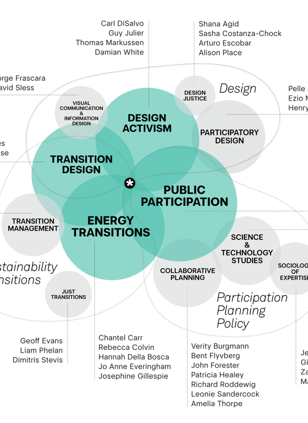
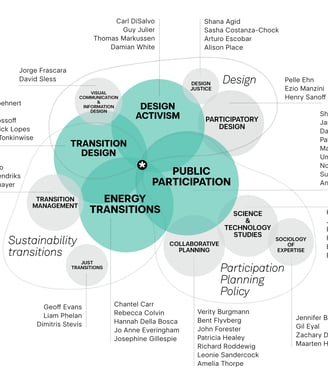
Examining the role of public participation and design in planning sustainability transitions
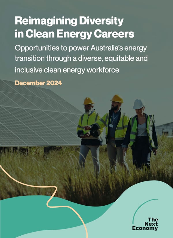
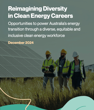
Reimagining diversity
Report with The Next Economy on boosting diversity in the clean energy workforce.